Using Open Data to Code an Interactive COVID-19 Map
Open Data and You
The “Open Data” movement — or the call for making valuable information free and accessible to anyone without restriction or limitation — enables everyday citizens to innovate in order to serve the needs of their communities. However, as we tinker and explore with public data sets, particularly when creating visuals to communicate these data, we must uphold stringent best practices to avoid spreading misinformation or promoting misinterpretation (learn more about this in Data Visualization and Covid-19). In the next sections, Rockefeller graduate student Caitlin Gilbert will take you through the steps of finding and preparing open COVID-19 data to make a thematic map showing virus spread in NYC using Shiny, a package in the free software environment R.
Here is what you will need to build your own dataviz app:
")
A Computer
The suggested minimum requirements are:
- At least 1GB of RAM (8GB preferred)
- At least 10GB of hard drive space
")
An Internet Connection
You only need a connection to download the files and software package, so having a connection is(temporarily) required. Fun tip: Test your internet speed with an internet speed test!
")
R/Shiny
Shiny combines the computational power of R with the interactivity of the modern web so you can easily build interactive web apps straight from R. Learn more about Shiny here. Don’t worry, R is a free software environment so Shiny doesn’t cost a thing!
")
Files
Caitlin has prepared a few files to make this easier for you:
- All_Modzcta.RDS (the COVID dataset used in the video)
- App.R (code for building the Shiny app)
- NYC_Covid_Prepdata.R (for preparing the data for visualization)
")
Time
It will take a lot of trial and error to get to where you want to be! Be kind to yourself and take your time to fail and learn!
A Primer on Using Shiny
For those who are not familiar with R/Shiny, we recommend that you check out Caitlin’s overview session before moving into the coding exercise below. If you are comfortable with R/Shiny, feel free to skip this step!
Build Your Own Map!
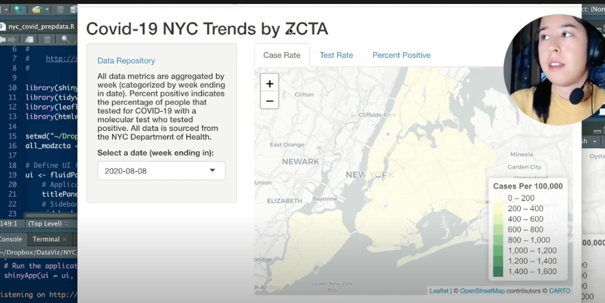
In this video, Caitlin will break down how you can make your own interactive choropleth map to visualize Covid-19 data in New York City. She will go through the data sourcing and cleaning steps before diving into building the final product using R/Shiny.
(Side note: a choropleth map is a type of thematic map showing a range of colors inside a predefined area, with color intensity proportional to a specific statistical variable such as population density)
Be sure to check out the introduction to R/Shiny video above, as well as the resources listed below, if you’ve never worked with R or Shiny before!


")


