Show some details of Viruses
Take a closer look at some resources for you to demonstrate some properties of viruses and experiments scientists use to study them
Give these a try...
Virus Origami
Using models from the educational portal of the RCSB Protein Data Bank (PDB), we will explore virus symmetry through paper origami. Paper origami, the art of folding papers into specific shapes, sizes, and forms, is a great tool for visualizing and modeling the shapes of viruses.
Print & Assemble Viral Capsids

Print the PDFs from the Save & Share Menu and assemble following the included instructions.
You will also need:
- Cardstock (printer paper can work but is flimsy)
- Printer (color preferred)
- Tape or glue
Using Open Data to Code an Interactive COVID-19 Map
Open Data and You
The “Open Data” movement — or the call for making valuable information free and accessible to anyone without restriction or limitation — enables everyday citizens to innovate in order to serve the needs of their communities. However, as we tinker and explore with public data sets, particularly when creating visuals to communicate these data, we must uphold stringent best practices to avoid spreading misinformation or promoting misinterpretation (learn more about this in Data Visualization and Covid-19). In the next sections, Rockefeller graduate student Caitlin Gilbert will take you through the steps of finding and preparing open COVID-19 data to make a thematic map showing virus spread in NYC using Shiny, a package in the free software environment R.
Here is what you will need to build your own dataviz app:
")
A Computer
The suggested minimum requirements are:
- At least 1GB of RAM (8GB preferred)
- At least 10GB of hard drive space
")
An Internet Connection
You only need a connection to download the files and software package, so having a connection is(temporarily) required. Fun tip: Test your internet speed with an internet speed test!
")
R/Shiny
Shiny combines the computational power of R with the interactivity of the modern web so you can easily build interactive web apps straight from R. Learn more about Shiny here. Don’t worry, R is a free software environment so Shiny doesn’t cost a thing!
")
Files
Caitlin has prepared a few files to make this easier for you:
- All_Modzcta.RDS (the COVID dataset used in the video)
- App.R (code for building the Shiny app)
- NYC_Covid_Prepdata.R (for preparing the data for visualization)
")
Time
It will take a lot of trial and error to get to where you want to be! Be kind to yourself and take your time to fail and learn!
How do scientists "see" viruses? Part 1: ELISA
ELISA works like a puzzle, where specific molecules lock together, a bit like puzzle pieces (though actually a bit more wiggly, like if puzzle pieces could shake hands or like this teacher with a unique handshake for each student). In this activity, cut out the puzzle pieces and assemble them just right to model the pieces of an ELISA.
Then, read more in the subsequent sections to learn more about the ELISA technique, antibodies, and more!
How do scientists "see" viruses? Part 2: qPCR
qPCR—quantitative PCR (polymerase chain reaction), sometimes also called real-time PCR—is a method for detecting nucleotide sequences (in this case, signatures of viral genomes) through a quick and often quantitative method.
We can simulate the detection of a virus by this method using many of the components scientists have used to design and implement tests for SARS-CoV2 since its discovery in December 2019. Viruses like SARS-CoV2 with genomes stored as RNA, the test has an added step for reverse-transcription of the RNA to DNA and these tests are then often referred to as RT-PCR. The entire process is summarized in the following infographic, which is also available for download in the Save & Share menu.
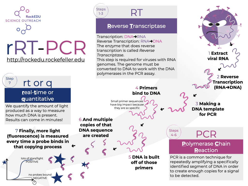
In the subsequent steps of the activity, we will 1) explore a key component of the specificity of PCR in general, 2) model the RT-PCR test for SARS-CoV2 in silico, and 3) model the added component that can make these tests quantitative and reasonably fast, making them a gold standard for virus identification in an infection.
Deepen your knowledge...
What is data visualization and why is it important?
Data visualization, also known as “dataviz,” is the graphical representation of information derived from data. Dataviz is particularly useful in the age of “big” data — large and complex datasets that are too unruly for traditional methods of analysis. By showcasing the patterns and outliers through visual means, we can more easily generate conclusions and actions that best address the questions surrounding these datasets. In this video, Rockefeller graduate fellow takes us through the basics of dataviz, and how it relates to the SARS-CoV-2 pandemic.


")


