5 Simple Ways to Make Our Science More Accessible
Let’s face it: we scientists love talking about our work! In fact, I’m sure my family and friends wish I shared a little less about my bacteria and code. While scientists have been trained to present our work to those in our field and non-specialists, we unintentionally exclude interested, engaged audiences because of how we present our work. By making our presentations, classes, and articles more accessible, we not only bring diverse scientists into the conversation, but we also think more critically about our own research.
Accessibility, as defined by the CDC, is “when the needs of people with disabilities are specifically considered, and products, services, and facilities are built or modified so that they can be used by people of all abilities.”

The disability pride flag, created by Ann Magill.
Those of us who work with plotting software, such as Prism, are aware of features such as colorblind-friendly palettes for plots. But, there are so many other ways we can make our work more accessible!
Below are 5 simple ways to make your presentation more accessible to diverse peoples, with the caveat that the best accessibility practices are created in collaboration with disabled people. As expressed in James Charlton’s book by the same title, “Nothing About Us Without Us” disabled people know their experience better than anyone else, and need to be in the forefront of all disability rights efforts. In the sources of this piece, I’ve highlighted work by disabled authors and scientists with an asterisk (*).
1. Include an informative title and logical Reading Order when designing slides
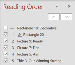
Screenshot of the Reading Order pane in Microsoft PowerPoint where slide objects are listed in an incorrect reading order. The order should be Title 3, Ready, Aim, Fire.
Many people in the blind community use screen readers or braille displays to translate visual presentations into accessible formats. These devices parse your slides in the order listed in the PowerPoint Reading Order pane . As author Holly Tuke explains, by including a descriptive title and logical Reading Order, you provide necessary context and readability to those with limited sight.
2. Set up tables properly in slides
When set up properly in a slide deck, tables can be easily read by assistive technologies. By correctly labeling the top row of a table as the “header” in the table tools (selecting “header row” in the table settings) screen readers and the like can parse tables. The same is true for the first column acting as row headers! By selecting “first column” in table settings, the first column can be read as the name of each row.
3. Use bold for emphasis and use a consistent, left-aligned layout
By using a logical and consistent layout your presentation more easily digestible and accessible to a variety of people including: the autistic, dyslexic, and processing disorders communities!
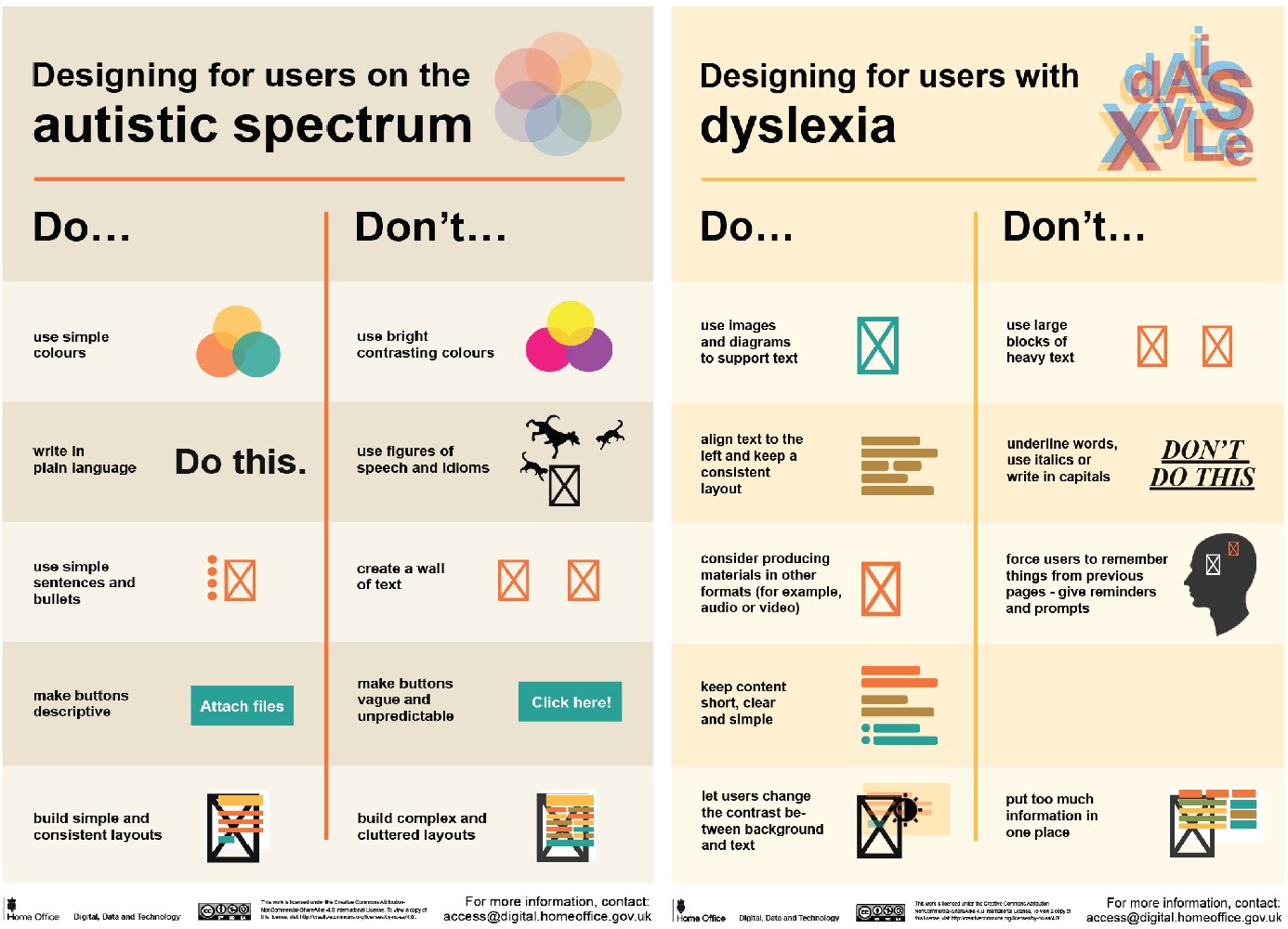
Posters showing the dos and don’ts of designing for users with accessibility needs including autism, and dyslexia. Images are from https://accessibility.blog.gov.uk/2016/09/02/dos-and-donts-on-designing-for-accessibility/.
4. Provide diverse methods of response
Most of us have attended talks and been too intimidated to ask a question during the Q and A portion. Now, imagine that you use an augmentative and alternative communication (AAC) device (such as: a speech generation device, a communication board, or a text-to-speech device) and you’re actually physically barred from asking a question. By providing multiple response methods- including written or typed submissions and sign language or oral interpreters– there can be more engagement with your work.
5. Render plots with descriptive alt text and labels, including take-aways in descriptions
Many of us take plots for granted, focusing on aesthetics over functionality. By making plots more accessible with descriptive labels and alt text we’re reminded that plot elements should be created with purpose. By including a descriptive title and alt text with context and take-aways we can identify key points and areas of confusion. See figure 2 for an example of appropriate alt text for a line plot.

Figure 2– A line chart showing the value of the pound in relation to euros and US dollars. A large drop is visible after the EU referendum in June 2016. Just before the referendum you could get 1.48 US dollars and 1.3 euros for each pound. After the referendum it fell to 1.29 US dollars and 1.16 euros- a fall of around 12%. Data source: Bank of England.
Plot source: Flourish
Whenever possible, placing labels on the plot (as US dollar and Euro are in Figure 2) is preferred over a legend, especially if color is used to differentiate components.
For more information about accessible plot design, visit the CFPB Design System’s site on data visualization guidelines.
Image 3- Graphic with a white background with black text that reads “Access Is Love” with a red heart as an ‘o’ in ‘love.’
For additional reading check out the Access Is Love reading list, complied by Sandy Ho, Mia Mingus, and Alice Wong and shared with me by Lindsey Lopes (graduate student and co-chair of RiSI).
Sources:
CDC Disability and Health Promotion
*Holly Tuke’s PowerPoint presentation accessibility
")
")


