Design as Science and Art
In creating the RockEDU website, the team at C&G Partners needed to blend design, science, and culture in completely new ways.

We worked seamlessly with the dedicated, passionate, and whip-smart RockEDU team to solve some interesting challenges:
How do we…
…make science accessible to global audiences without dumbing it down?
…let teachers navigate effortlessly through content that is both wide and deep?
…help Nobel-quality scientists connect to budding scientific minds?
So our goal was to create an experience that is…
…fun.
…easy.
…smart.
Teachers, Scientists, and Students, Oh My!
We start by defining exactly who we wanted to help and how:
Teachers
Our primary goal is to have teachers—some of the hardest working and most passionate people—spend less energy on preparation, and more on teaching. This means providing exciting, easy-to-find science resources.
Scientists
Rockefeller scientist are among the world’s best, passionate about their communities and their science. So we need to help them learn to connect with kids and to calibrate lessons for classrooms of varying levels and resources.
Students
The most important lesson: science isn’t dusty and dull! It’s an exciting realm of open-ended questions, where answers can be found using items from your kitchen cabinets. Once we’re there, we just point them in the right direction.
First Impressions & Continued Delight
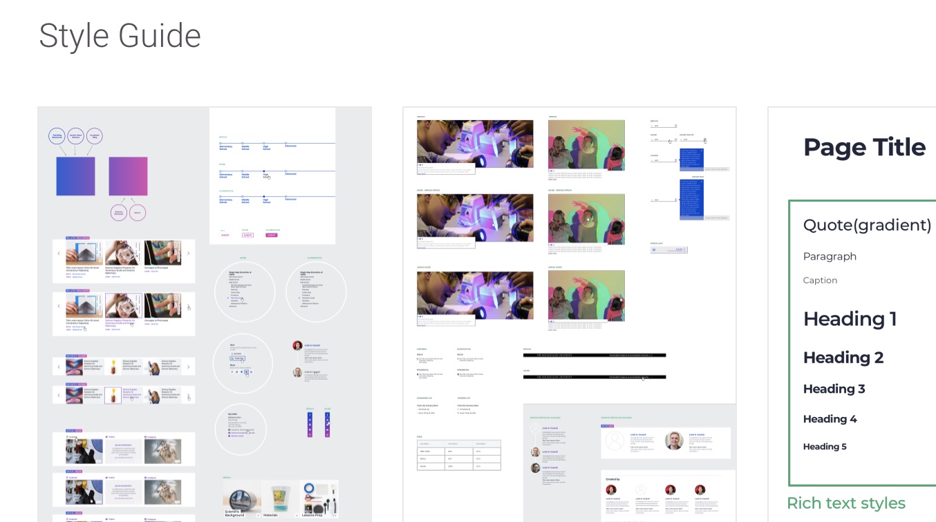
People form opinions in milliseconds, so we started with brand identity. The message is: “this is your type of site, and you can have fun here.”
From hot pink to electric blue, we chose the bold and vibrant colors that youth flock to—and that traditional science education have avoided. To educators, the palette would evoke colors producible in scientific experiments.
The design shapes are inspired by scientific notation. No mere decoration, they earn their space by providing function: from circles enclosing menu elements to arrows directing users through the various steps of the experiments.
Nothing is superficial or decorative; everything serves both form and function.
Navigating an Embarrassment of Riches
The RockEDU website provides with an abundance of resources, both deep and diverse. Yet, time-strapped teachers need to find exactly the resource that fits their students…pronto!
Step #1: What’s Here for Me?
We created RockEDU’s classroom resources as a central destination, then narrowed the filter list to teachers’ most important decision-making criteria: topic, level, and classroom resources.
Step #2: A Sneak Peek
Teachers can quickly see if a resource might fit their needs through a summary page for each resource. Once they choose a level that fits their students, the next page displays an expandable grid lets them peek at the components without getting lost in the weeds.
Step #3: I Found The One! …Now What?
Teachers and students can review the entirety of the content online—and yet we wanted to reach classrooms without computers or internet. So we ensured that teachers could download beautiful, printable resources for classrooms and labs.
C&G Partners: Design for Culture (from Museums to Petri Dishes)
From cultural organizations, to organizational culture, to bacterial cultures, C&G Partners does it all. We work closely and collaboratively with clients to create websites, branding, digital signage, museum exhibits, and more.
We’re proud of all our clients and partners, including the American Association for the Advancement of Science, the National Museum of Natural History, the New York Hall of Science, the Griffith Observatory, and others.
Visitors will usually find bikes, dogs, coffee mugs…and snacks at 3:30.

